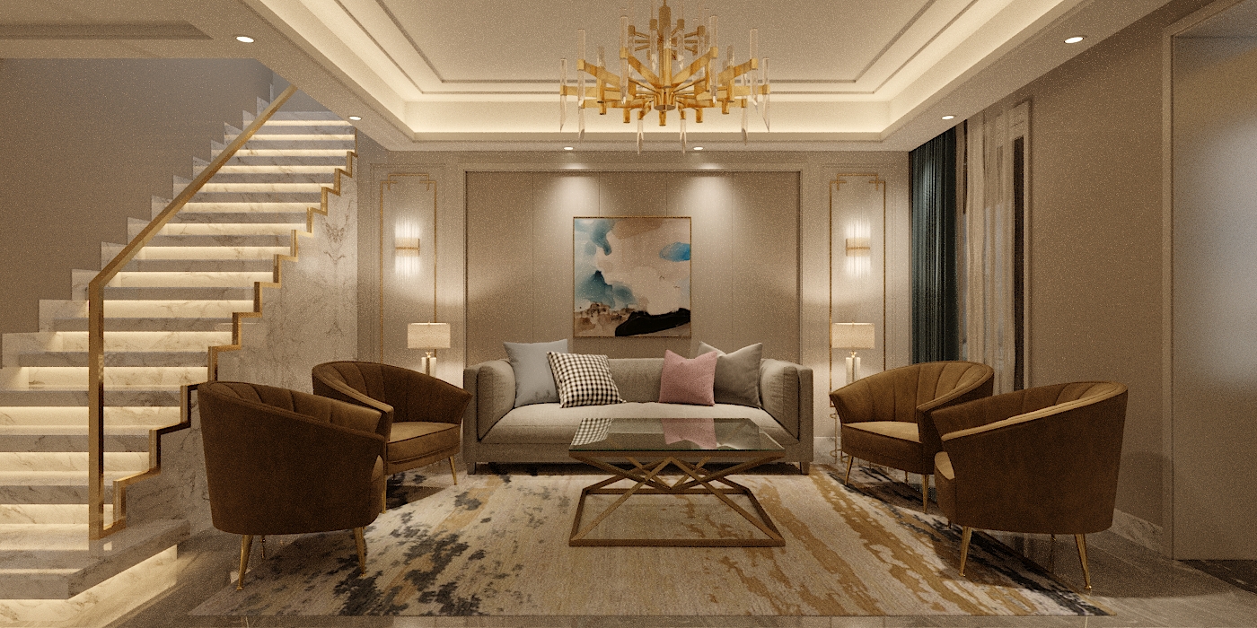
Cream White Living Room Ideas
The easiest way to have wonderful living room ideas is to include the colors that you love and feel comfortable to be surrounded with. When you begin with your favorite colors, you are not limited to the traditional color schemes. Choosing your favorite colors as your base colors can be the seamless inspiration for your new color for the whole room. The following is some examples of our customers’ favorite colors as well as some living room ideas.![]()
Off-white and cream
Another color scheme that suits many living room ideas is the off-white color. This color stands as a bridge between the absolutely pure white and cream. Off- white doesn’t have the same richness as cream, but it belongs to the same family. Off-whites are the perfect companion with cream that can match very well with many living room furniture, not only because they mix with them, but because they prevent a totally cream scheme from becoming too sickly.
When it comes to the interior design, the cream color scheme can work well with navy, black and grey while reds and purples and oranges aren’t easy to be introduced. Experiment on coming up with elegant living room ideas has shown that cream is a natural friend to different color schemes, including sand tones and browns, but the cream is not so easy to be mixed with taupe. So, if you want to use natural linens in a cream scheme, look for ones that have undertones of green or living room furniture that has the green scheme.![]()
Customers who are concerned with interior design should take texture into their consideration. The texture is an essential part of any neutral scheme, but having cream on cream room demands more. If everything is covered in cream, you must have textural contrast in order to give it a lift and bring an elegant aesthetic into your living room. Also, you have to remember that cream could be affected by natural light unlike other colors, it is not the best choice for homes in very sunny climates, because there is a danger of being extremely bright, rather than reassuringly calm.
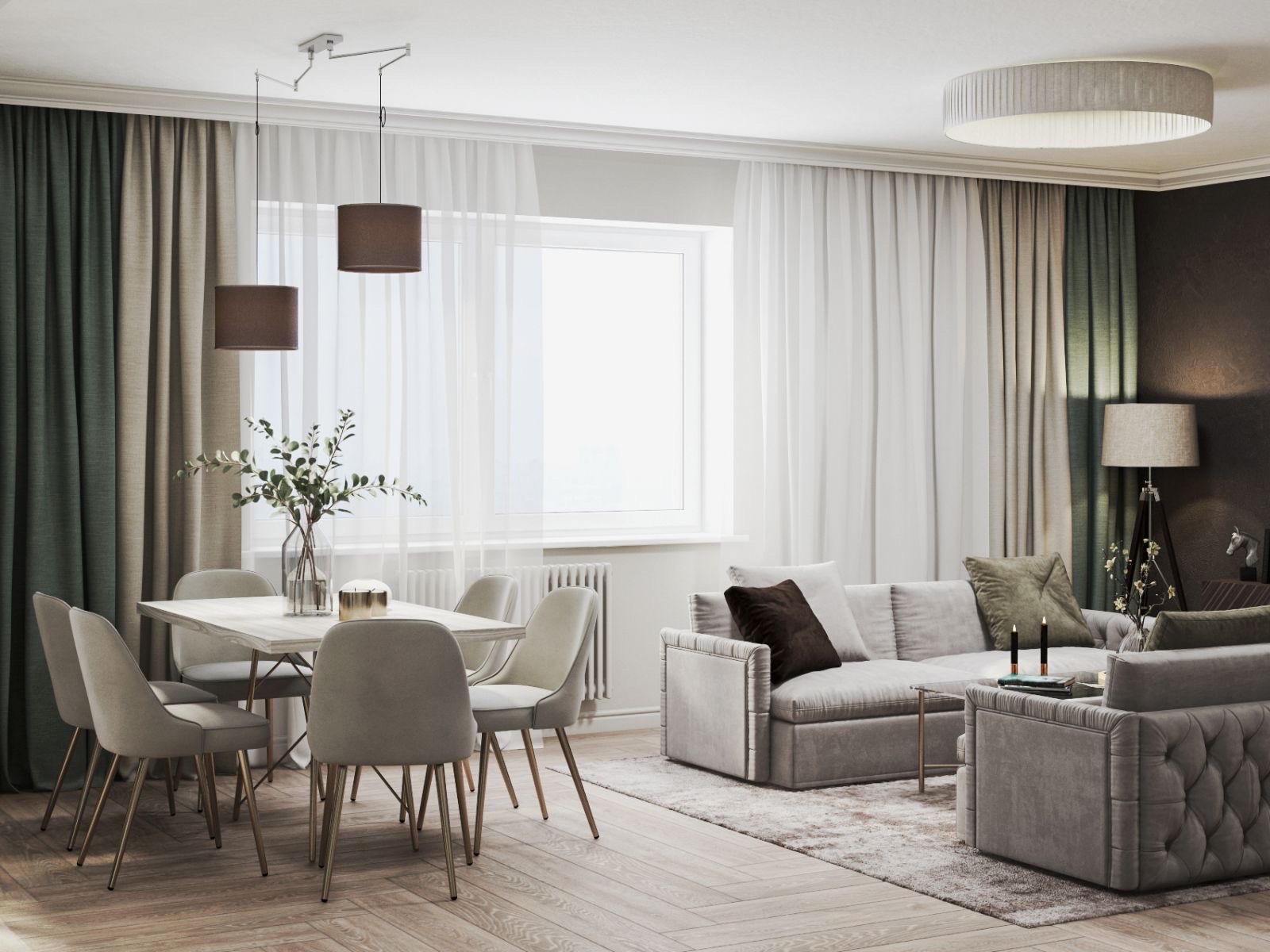
Sand tones
Sand is another color that brings many living room ideas into your interior space. It is stylish, warm, comforting and enveloping. It creates an atmosphere that is truly inviting – a place where people feel relaxed and comfortable. It also has some practical and positive sides for being more low maintenance than other lighter colours. Sand colour is popular with young and energetic families or with people who live in a rural setting. Simple because it suits many different living room furniture. Sand tones have an earthiness that links you directly to the natural world.
Some customers are sometimes attracted to sand’s richness, but there is a risk of becoming uncontrollable if you don’t hold back a little to suit your living room furniture. For this reason, sand fabrics are chosen in home décor with a hint of pattern, such as a check or stripe.
This helps to reduce the expanse of pure sand colour in a modest way.
Sand Vs. Taupe
People who are concerned with interior design claim that sand tones never mix well with taupe as there is a hint of pinkiness in taupe that contradicts with the yellowish color in the sand. They will never be friends, so don’t waste your time trying to mix them up. Sand color is an easy palette to be used living room furniture that colors, including creams, whites and browns. Having a white room with sand tones will be very different in feel and look from a room where sand is the dominant shade.
Customers who are concerned with interior design should take texture into their consideration. Texture plays a fundamental part in all neutral color schemes. In your living room furniture, it is important to use texture where sand tones are concerned or you may end up with a room that looks characterless and flat. The fact is that you will never have too much texture, so juxtapose coarse with delicate, and dense with translucent in order to give depth to the scheme. If you are willing to highlight and accentuate the richness of sand, luxuriously inlaid woods, such as marquetry tables, polished wooden floors tan leather furniture could be added.
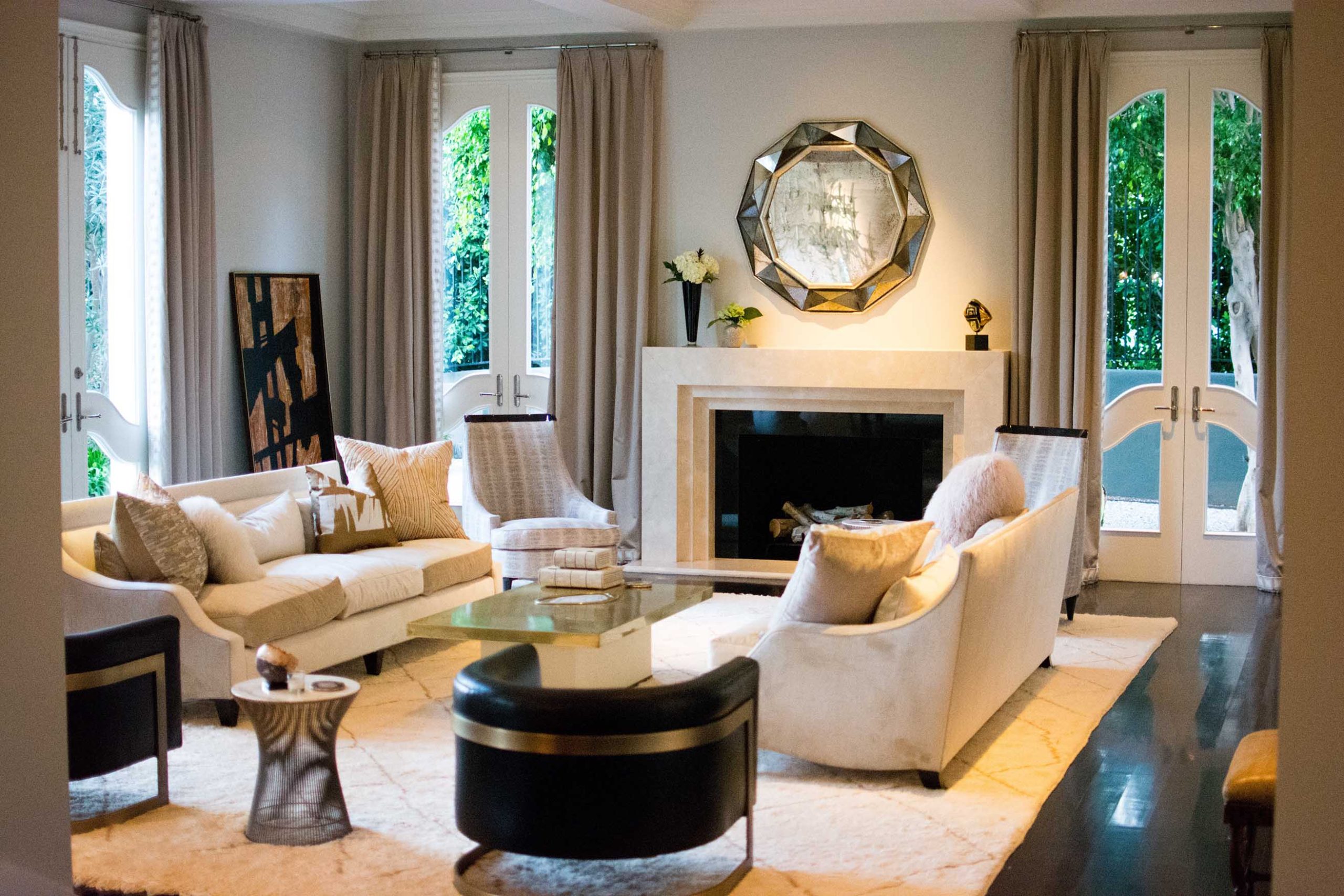
Taupe
Taupe is the most perfect choice for neutral colors; it is neither too warm nor cool. Taupe not only helps in bringing quietness into your interior space but also a deep sense of relaxation which restores balance to your mind. For our customers who are interested in the neutral palette, it might also be interesting to realize how many shades of taupe color there are. This color hangs between brown and grey and includes many variations in tone.
Taupe Vs. Yellow
In fact, the only color taupe really doesn’t like is yellow. Having a creamy paint or buttery fabrics in a taupe color scheme and becomes mismatching and needs to be avoided. Living room furniture such as oak, yellowy metals such as bronze and yellowy stone such as beige limestone need to be also avoided when mixing with taupe. Taupe and sand are far from each other in terms of design as the north and south poles.
In terms of interior design, Taupe can be elegantly decorated with a refined combination of color and texture. Metals such as chrome or stainless steel also feel seamless at home in a taupe scheme.
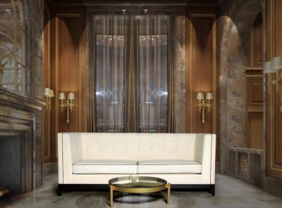
Pure White
Pure white is a fabulous colour to design bring many living room ideas with elegant, clean, fresh, spiritual and totally life-enhancing into your living space. Pure white room is one of the most lively and energetic colours. Mixing white with white or white with cream is one of most stylish combinations to be brought into your home décor (there are literally hundreds of shades to choose from), but as with cream rooms, it is important to have a lot of textural contrast.


Artis 2 Seat Upholstered Sofa
£888.00 Including VAT


Ethan Upholstered Curved 2 Seater Sofa
£1,241.00 Including VAT

Victor Tufted Upholstered Sofa
£1,177.00 Including VAT
White is a truly versatile and absolutely divine colour. Taupe and sand may work against each other perfectly, but white works happily with both. The white colour also loves bold accent colours, including red, purple or navy blue. In fact, the only colour that holds the white colour back black, which can look too cruel with pure white. Black-framed artwork is the exception because it creates good graphic shapes against the white wall. Concerning interior design and accessories, almost anything goes, but white lacquer, clear glass or spot colours of vibrant fresh flowers are particularly effective and absolutely divine.
